Plotting overview
Data visualization is essential for exploring, understanding, and communicating insights from data. This guide covers common plot types, their purposes, and when to use them.
1. Plot selection guide
1.1. By analysis goal
| Goal | Recommended plot types |
|---|---|
| Understand distribution of single variable | Histogram, Box plot, Violin plot, Density plot |
| Compare groups | Box plot, Violin plot, Bar chart, Strip plot |
| Find relationships between variables | Scatter plot, Line plot, Regression plot, Heatmap |
| Show composition | Pie chart, Stacked bar chart, Area plot |
| Analyze time series | Line plot, Area plot, Seasonal plot |
| Detect outliers | Box plot, Scatter plot, Strip plot |
| Explore multivariate data | Pair plot, Correlation heatmap, Facet grid |
| Check statistical assumptions | Q-Q plot, Residual plot, Histogram |
| Show uncertainty | Error bars, Confidence bands, Violin plots |
1.2. By data type combination
| X Variable | Y Variable | Z Variable (optional) | Recommended Plots |
|---|---|---|---|
| Categorical | None | None | Bar chart, Pie chart, Count plot |
| Continuous | None | Box plot, Violin plot, Bar chart, Strip plot | |
| Categorical | None | Heatmap, Stacked bar chart, Grouped bar chart | |
| Continuous | None | None | Histogram, Box plot, Violin plot, Density plot |
| Continuous | None | Scatter plot, Line plot, Hexbin, 2D density | |
| Continuous | 3D scatter, Bubble chart, Contour plot | ||
| Categorical | Scatter with hue, Facet grid |
2. Best practices
2.1. General guidelines
- Choose the right plot for your data type and message
- Match plot type to data structure (categorical vs continuous)
-
Consider what you want to communicate
-
Keep it simple
- Avoid unnecessary 3D effects
- Remove chart junk (excessive gridlines, decorations)
-
Use appropriate aspect ratios
-
Use color effectively
- Use color to encode information, not just for decoration
- Ensure accessibility (colorblind-friendly palettes)
-
Maintain consistency across related plots
-
Label clearly
- Always include axis labels with units
- Add informative titles
- Include legends when needed
-
Annotate important points
-
Consider your audience
- Technical vs general audience
- Level of detail appropriate for context
- Medium of presentation (paper, screen, presentation)
2.2. Common mistakes to avoid
| Mistake | Problem | Solution |
|---|---|---|
| Starting y-axis at non-zero | Exaggerates differences | Start at zero for bar charts; flexible for line plots |
| Too many categories | Cluttered, hard to read | Limit to 7-10 categories; consider grouping or filtering |
| 3D when 2D suffices | Distorts perception, hard to read | Use 2D alternatives with color or size |
| Pie charts with many slices | Hard to compare angles | Use bar chart instead |
| Dual y-axes | Can be misleading | Use separate plots or normalize scales |
| Missing error bars | Unclear uncertainty | Add error bars or confidence intervals |
| Poor color choices | Not colorblind-safe, poor contrast | Use established palettes (ColorBrewer, Seaborn) |
| Overplotting | Too many overlapping points | Use transparency, jitter, hexbin, or sample data |
3. Common plot types by data type and purpose
3.1. Univariate plots (single variable)
| Plot Type | Example | Data Type | Purpose | Key Features | Python Implementation |
|---|---|---|---|---|---|
| Histogram | 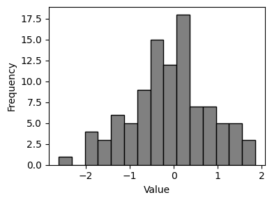 |
Continuous | Show distribution and frequency of values | Bins group continuous data; bar heights show frequency | plt.hist(data, bins=30) or sns.histplot(data) |
| Box Plot (Box-and-Whisker) | 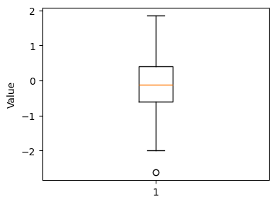 |
Continuous | Display distribution summary (quartiles, median, outliers) | Shows Q1, median, Q3, whiskers (1.5×IQR), and outliers as points | plt.boxplot(data) or sns.boxplot(data) |
| Violin Plot | 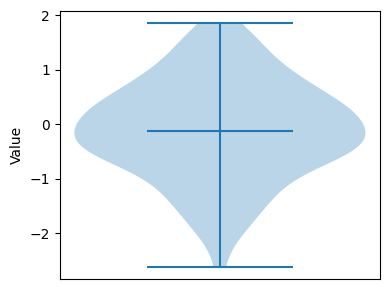 |
Continuous | Combination of box plot and density plot | Wider sections indicate higher density; includes median marker | sns.violinplot(x=data) |
| Density Plot (KDE) | 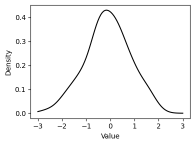 |
Continuous | Smooth estimate of probability density function | Smooth curve showing probability density | sns.kdeplot(data) or data.plot(kind='kde') |
| Bar Chart | 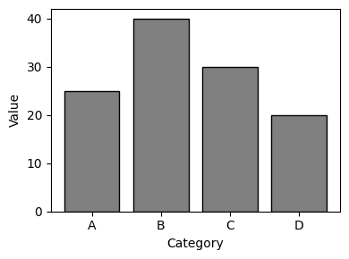 |
Categorical | Compare frequencies or values across categories | Each bar represents a category; height shows value/count | plt.bar(categories, values) or sns.barplot(x, y) |
| Count Plot | 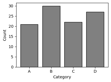 |
Categorical | Show frequency of categorical values | Specialized bar chart for counts | sns.countplot(x=category) |
| Pie Chart | 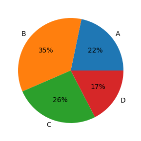 |
Categorical | Show proportions of a whole | Circular chart divided into slices; each slice represents proportion | plt.pie(values, labels=labels) |
| Strip Plot | 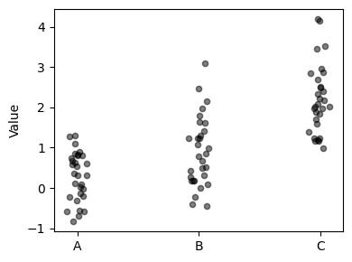 |
Continuous (grouped by category) | Show individual data points along one axis | Points plotted along axis; shows each individual value | sns.stripplot(x=category, y=values) |
| Swarm Plot | 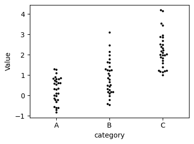 |
Continuous (grouped by category) | Like strip plot but points don't overlap | Non-overlapping points; good for seeing density | sns.swarmplot(x=category, y=values) |
3.2. Bivariate plots (two variables)
| Plot Type | Example | X-axis Type | Y-axis Type | Purpose | Key Features | Python Implementation |
|---|---|---|---|---|---|---|
| Scatter Plot | 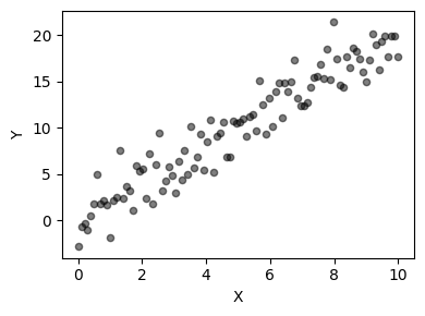 |
Continuous | Continuous | Show relationship between two continuous variables | Each point represents one observation | plt.scatter(x, y) or sns.scatterplot(x, y) |
| Line Plot | 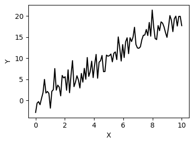 |
Continuous/Time | Continuous | Show trends over continuous variable (often time) | Points connected by lines | plt.plot(x, y) or data.plot() |
| Bar Chart | |
Categorical | Continuous | Compare continuous values across categories | Bars represent values for each category | plt.bar(categories, values) or sns.barplot(x, y) |
| Box Plot (Grouped) | 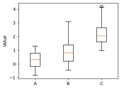 |
Categorical | Continuous | Compare distributions across categories | Multiple box plots side by side | sns.boxplot(x=category, y=values) |
| Violin Plot (Grouped) | 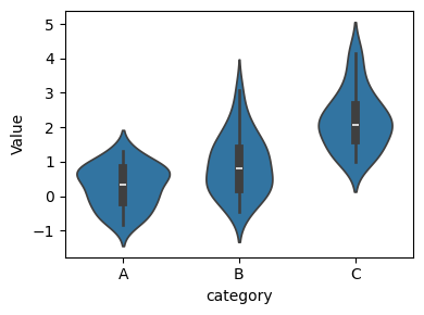 |
Categorical | Continuous | Compare distribution shapes across categories | Multiple violin plots side by side | sns.violinplot(x=category, y=values) |
| Heatmap | 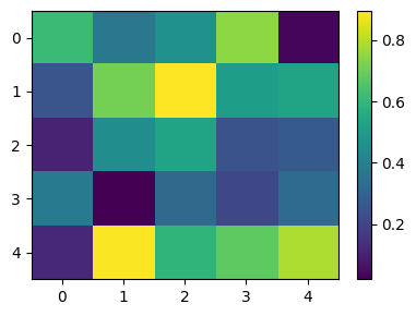 |
Categorical/Discrete | Categorical/Discrete | Show magnitude of values in two-dimensional space | Color intensity represents value magnitude | sns.heatmap(data, annot=True) |
| Hexbin Plot | 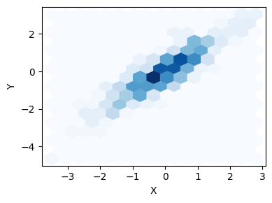 |
Continuous | Continuous | Show density of points in 2D space | Hexagonal bins; color shows point density | plt.hexbin(x, y, gridsize=30) |
| 2D Density Plot | 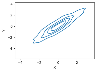 |
Continuous | Continuous | Show probability density in 2D space | Contour lines or color gradients show density | sns.kdeplot(x=x, y=y) |
| Joint Plot | 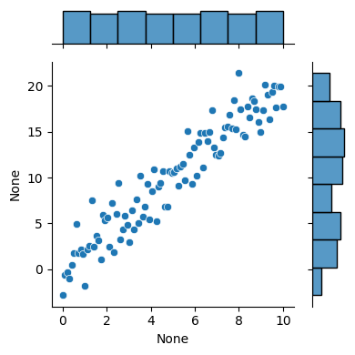 |
Continuous | Continuous | Combine scatter plot with marginal distributions | Central scatter with histograms/KDEs on margins | sns.jointplot(x=x, y=y) |
3.3. Multivariate plots (three or more variables)
| Plot Type | Example | Purpose | Key Features | Python Implementation |
|---|---|---|---|---|
| Pair Plot (Scatter Matrix) | 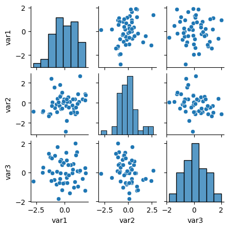 |
Show all pairwise relationships in dataset | Grid of scatter plots; diagonal shows distributions | sns.pairplot(dataframe) |
| 3D Scatter Plot | 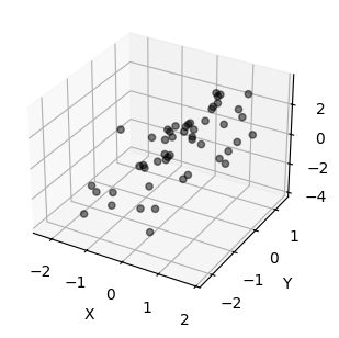 |
Show relationship between three continuous variables | Points plotted in 3D space | from mpl_toolkits.mplot3d import Axes3D then ax.scatter3D(x, y, z) |
| Bubble Chart | 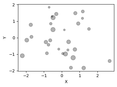 |
Show three continuous variables (x, y, size) | Like scatter plot but point size represents third variable | plt.scatter(x, y, s=sizes) |
| Facet Grid (Small Multiples) | 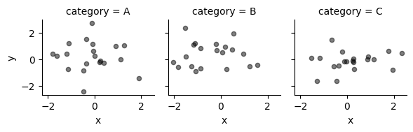 |
Show subsets of data in separate subplots | Multiple plots arranged in grid | sns.FacetGrid(data, col='category').map(plt.scatter, 'x', 'y') |
| Parallel Coordinates | 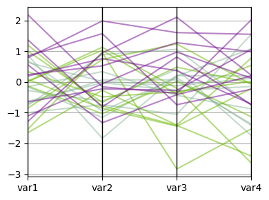 |
Compare multiple variables across observations | Lines connect values across parallel axes | pd.plotting.parallel_coordinates(df, 'class_column') |
| Correlation Heatmap | 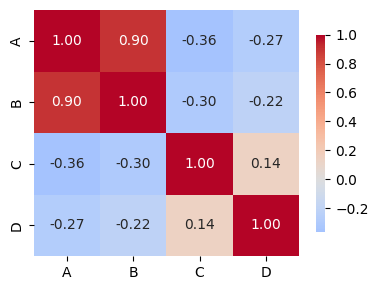 |
Show correlation between all variable pairs | Color-coded correlation matrix | sns.heatmap(df.corr(), annot=True) |
3.4. Specialized statistical plots
| Plot Type | Example | Purpose | Key Features | Python Implementation |
|---|---|---|---|---|
| Q-Q Plot (Quantile-Quantile) | 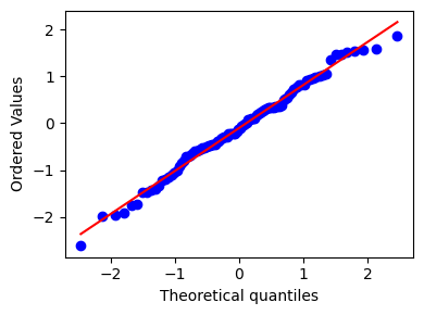 |
Test if data follows theoretical distribution | Points should follow diagonal line if normally distributed | stats.probplot(data, dist="norm", plot=plt) |
| Residual Plot | 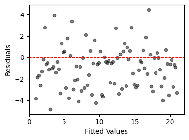 |
Diagnose regression model fit | Plot residuals vs fitted values; should show random pattern | sns.residplot(x=predictions, y=residuals) |
| ROC Curve | 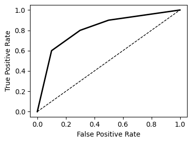 |
Evaluate binary classifier performance | Plots True Positive Rate vs False Positive Rate | from sklearn.metrics import roc_curve then plt.plot(fpr, tpr) |
| Confusion Matrix | 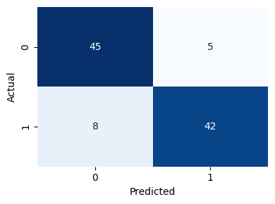 |
Show classification results | Matrix showing predicted vs actual classes | sns.heatmap(confusion_matrix, annot=True, fmt='d') |
| Error Bars | 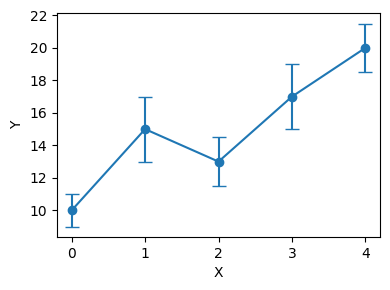 |
Show uncertainty or variability | Bars extend from points to show range | plt.errorbar(x, y, yerr=errors) |
| Regression Plot | 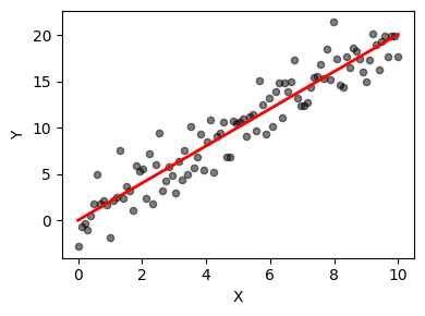 |
Show linear relationship and confidence interval | Scatter plot with fitted line and confidence band | sns.regplot(x=x, y=y) |
3.5. Time series plots
| Plot Type | Example | Purpose | Key Features | Python Implementation |
|---|---|---|---|---|
| Line Plot | 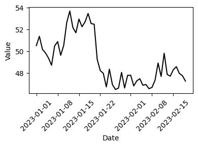 |
Show values changing over time | X-axis is time; y-axis is value | plt.plot(dates, values) or data.plot() |
| Area Plot | 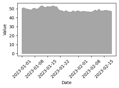 |
Show cumulative totals over time | Filled area under line(s) | data.plot.area() or plt.fill_between(x, y) |
| Stacked Area Plot | 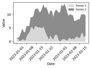 |
Show multiple time series composition | Multiple series stacked on top of each other | data.plot.area(stacked=True) |
| Seasonal Plot | 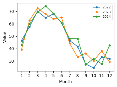 |
Show patterns that repeat over time | Multiple lines for each season/cycle | Manually create with groupby and plot |
| Autocorrelation Plot | 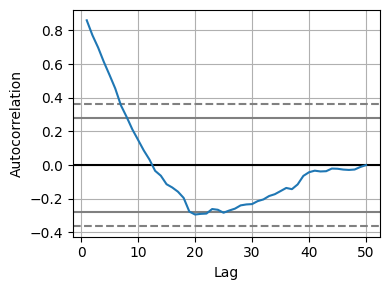 |
Show correlation of series with lagged versions | Correlation at different lag values | pd.plotting.autocorrelation_plot(data) |
| Lag Plot | 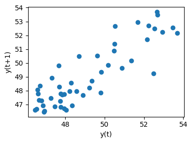 |
Check for randomness in time series | Current value vs lagged value | pd.plotting.lag_plot(data) |
4. Additional resources
4.1. Python visualization libraries
| Library | Strengths | Best For | Import Statement |
|---|---|---|---|
| Matplotlib | Highly customizable, fine control | Publication-quality plots, custom visualizations | import matplotlib.pyplot as plt |
| Seaborn | Beautiful defaults, statistical plots | Exploratory data analysis, statistical visualization | import seaborn as sns |
| Pandas | Integrated with DataFrames | Quick exploration, simple plots | Built-in: df.plot() |
| Plotly | Interactive plots, 3D support | Dashboards, web applications, interactive exploration | import plotly.express as px |
| Bokeh | Interactive web-ready plots | Interactive dashboards, streaming data | from bokeh.plotting import figure |
4.2. Recommended reading
- "The Visual Display of Quantitative Information" by Edward Tufte
- "Fundamentals of Data Visualization" by Claus O. Wilke
- "Storytelling with Data" by Cole Nussbaumer Knaflic
4.3. Python plotting resources
- ColorBrewer: Color schemes for maps and data visualization
- Seaborn Gallery: Examples of statistical plots
- Matplotlib Gallery: Comprehensive plot examples
- Python Graph Gallery: Collection of plot types with code
4.4. Color palettes
# Colorblind-friendly palettes
sns.color_palette("colorblind")
sns.color_palette("Set2")

# Diverging (for correlation matrices)
sns.color_palette("RdBu_r", as_cmap=True)
sns.color_palette("coolwarm", as_cmap=True)

# Sequential (for heatmaps)
sns.color_palette("YlOrRd", as_cmap=True)
sns.color_palette("viridis", as_cmap=True)